
Branding an Office Design & Construction Company

Material finishes used in Sheldon’s new Sydney Headquarters, reflective of the company’s branding.
How Sheldon connects people, performance & planet through workplace design & construction.
For design and construction companies that offer multiple services under one roof, cohesive and encapsulating branding is key. Through a carefully considered visual and messaging identity across marketing activities, clients are able to quickly understand not only the scope of services offered, but how design and construction elements come together to form a turn-key offering. At Sheldon, we recently refreshed our branding to relfect the offices we created and services we offer, under the tag line of “Workplaces for People, Performance and Planet. Here is how we did it…


So we started with three main pillars to guide our content messaging - People, Performance and Planet.
"People" refers to two things - Externally, creating people and future focused workplaces for our clients through meaningful workplace strategy. Internally, it also encompasses the positive and supportive culture that we strive to foster within the team at Sheldon.
"Performance" again, relates to our aim to create spaces that are, custom and efficient to our clients operations. But importantly it also encompasses the 36 years of experience of our in house design, construction, services, partitioning, and manufacturing teams, providing a turn-key fitout experience through a delivery process that prioritises quality, safety, agility, and peace of mind for our clients.
"Planet", not surprisingly, encompasses how Sheldon uses circular economy principles to create sustainable offices, through a design and construct processes that also prioritises sustainability.
To visually reflect this messaging, our brand palette establishes a colour for each pillar. People Orange, Planet Green, and Performance Earth, with shade variations and our signature grey creating a diverse yet cohesive selection of colours to represent our brand. And we selected these colours for their warmth, natural tones, and timelessness to mirror the feeling that we achieve with our fitouts.
And then in that same vein, we have selected our branding fonts to be used across our content for their clean simplicity and adaptability (refer to images above).

Digitally, these visual elements dictate the look and feel of the content we create for our social media, website, and company documents.
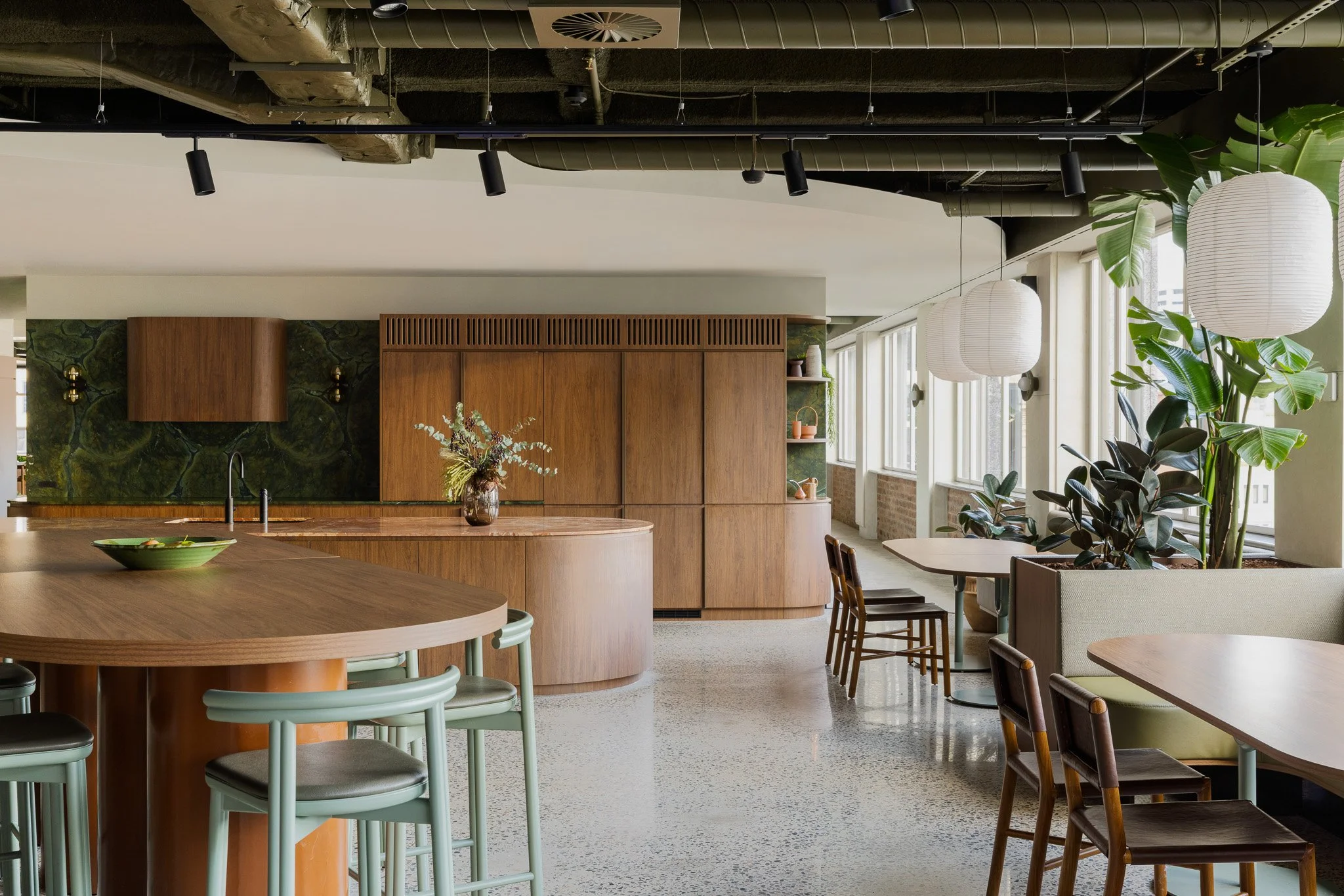
In person, our colours can be found throughout our new office.
Key Branding Considerations for Design & Construction
Start with purpose, promise and positioning; define memorable pillars (capability, certainty, impact).
Translate purpose into proof: end-to-end D&C process, program certainty, sustainability, measurable outcomes.
Craft verbal identity: tone, key messaging, proof library, claims governance.
Design visual system: logo rules, accessible colour palette, type hierarchy, imagery style, iconography. It is important that this aligns with and compliments your team and project imagery.
Operationalise: reusable proposal/case study templates, site signage, digital assets, co-branding rules.
Embed in workflow from discovery to post-occupancy, aligning story with delivery.
Refresh annually with any new project imagery and testimonials.